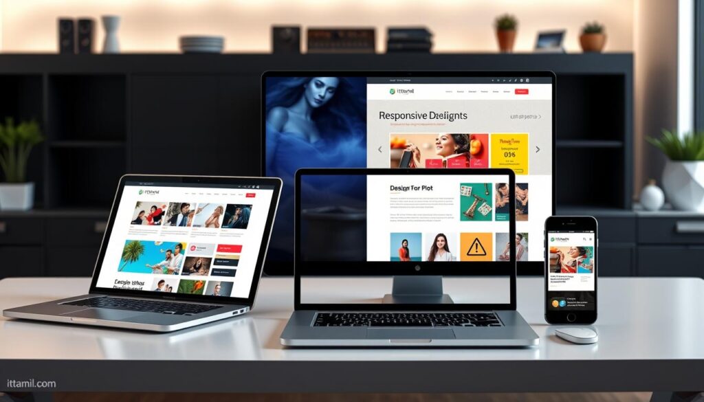
In today’s world, having a website that works on any device is key. Responsive WordPress design makes it easy to create beautiful, mobile-friendly sites. These sites work great on desktops, tablets, or smartphones.
Key Takeaways
- Responsive WordPress design ensures your website is optimized for all devices, delivering a seamless user experience.
- WordPress provides a flexible platform to create modern, adaptable websites that cater to your audience’s needs.
- Responsive design enables you to reach a wider audience and improve accessibility across different devices.
- Leveraging the power of WordPress, you can build stunning, mobile-friendly websites that stand out in the digital landscape.
- Responsive WordPress design allows you to future-proof your online presence and stay ahead of the curve in a constantly evolving digital world.
Understanding Responsive WordPress Design
In today’s digital world, responsive design is key for websites. It makes sure your site looks great on any device. This means your visitors get a smooth and fun experience.
What is Responsive Design?
Responsive design lets websites change how they look based on the device. It works on computers, tablets, and phones. This is done with flexible grids and media queries.
Benefits of a Responsive Website
- Improved User Experience: Your visitors can easily find what they need. This makes them happy and keeps them coming back.
- Increased Accessibility: More people can use your site, including those with disabilities.
- Enhanced Search Engine Optimization (SEO): Google likes websites that work well on phones. This can help your site show up more in searches.
Responsive WordPress design meets the needs of all your visitors. It makes your site better and brings in more people. This helps your brand and boosts your site’s success.
Responsive WordPress Design: The Key Principles
Creating a great responsive WordPress design needs a good grasp of key principles. These principles help make WordPress sites work well on any device. They ensure a smooth and easy user experience, no matter where you are.
First, it’s important to use flexible grids and layouts. This means using CSS to make your site look good on all screens. From big desktops to small phones, your site should always be easy to use.
Next, you must optimize media and images for different screens. This means making images smaller and using smart image techniques. It also means making sure everything loads fast on all devices. This makes your site fun to use on any device.
Lastly, using CSS wisely is key for adaptable content. Media queries and responsive design help your site change to fit the user’s device. This makes your site look good and work well on any device.
By following these responsive WordPress design principles, you can make a site that grabs people’s attention. It will work well on any device, leading to more engagement and success online.

Creating a Responsive WordPress Website
Building a responsive WordPress website starts with picking a theme that works on all devices. Many themes now come with built-in responsive design. This makes it easier to create sites that work well on phones, tablets, and computers.
Choosing the Right WordPress Theme
When picking a WordPress theme, look for one that works well on all devices. Choose themes that focus on mobile users first. This ensures your site looks good on any screen size.
Also, pick themes that let you customize. This way, you can make your site look just like your brand.
Leveraging Responsive Plugins
Responsive plugins can also make your website better. They help with things like making images load faster and creating easy-to-use menus on any device. These tools make it easier to create a site that works well for everyone.
FAQ
What is responsive WordPress design?
Responsive WordPress design makes your website change to fit any screen size. It works on phones, tablets, and computers. This way, everyone gets a great experience, no matter what device they use.
What are the benefits of a responsive website?
Responsive websites are better for users and search engines. They work well on all devices. This means more people can see your site and find what they need.
What are the key principles of responsive WordPress design?
Good responsive design uses flexible grids and layouts. It also optimizes images and uses CSS well. These steps help your site look great on any device.
How can I create a responsive WordPress website?
Start by picking a responsive WordPress theme. Many themes are mobile-friendly. You can also use plugins to make your site even better.
Choosing the right theme and plugins makes creating a responsive site easy. This way, your site works well on all devices.